The following is an email I wrote to the COVID response team at my workplace. I have since had many conversations with people and wanted to show them the research I have done and the numbers I could and, more importantly, could not find.
I have yet to hear a decent refutation of these numbers. The usual response is something like, "I trust the CDC and 3 years of data is good enough."
This email was written sometime around April/June of 2021 so some of the numbers are incomplete. Updated numbers as of today (Dec. 22, 2021) has not really changed my assessment.
[ EMAIL START ]
Hi COVID response team,
Thanks for your work. As engineers and scientists we are taught to be skeptical. I have therefore tried to dig around in the numbers I could find.
I found this paper written by 3 economists very interesting comparing mortality rates between Denmark, Finland, Norway, and Sweden https://papers.ssrn.com/sol3/papers.cfm?abstract_id=3674138 (and a summary here https://www.aier.org/article/swedens-high-covid-death-rates-among-the-nordics-dry-tinder-and-other-important-factors/). They propose the dry tinder theory. The reason I find that interesting is that Sweden’s charts over the last several years look very similar to our own. We had a very mild flue season the last 2 years and then we were hit fairly hard by COVID.
Research that I would like to do but can’t find the numbers is to look at the last 150 years of mortality deaths and compare them. Most news bites and the CDC (https://www.cdc.gov/nchs/nvss/vsrr/covid19/excess_deaths.htm see chart below) seem to only show the public what has happened in the last 4 years which feels very misleading to me because I’m not sure how you can draw an accurate trendline based on 4 years of data. You should be looking at 100+ years. If you are going to make the claim that this is worse or comparable to the Spanish Flu then I need some numbers to back those claims.

I did my best by going to data.gov and plotting all mortality numbers by week. The best I could do was go back to 2014. Sources:
https://catalog.data.gov/dataset/weekly-counts-of-deaths-by-state-and-select-causes-2014-2018 https://catalog.data.gov/dataset/weekly-counts-of-deaths-by-state-and-select-causes-2019-2020
I combined the data into one spreadsheet which I have attached.
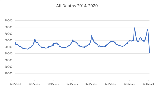
If we slice each year by the mortality valley, which appears to be around August I made the following table.
| Aug-July | Total | % Change |
|---|---|---|
| 2014-2015 | 2,699,118 | |
| 2015-2016 | 2,692,140 | -0.00259 |
| 2016-2017 | 2,783,134 | 0.0338 |
| 0.018689018 | 2,835,147 | 0.018689 |
| 2018-2019 | 2,823,934 | 0.108804 |
| 2019-2020* | 1,571,180 | |
| average | 2,827,443 |
*Short 7+ months due to insufficient data
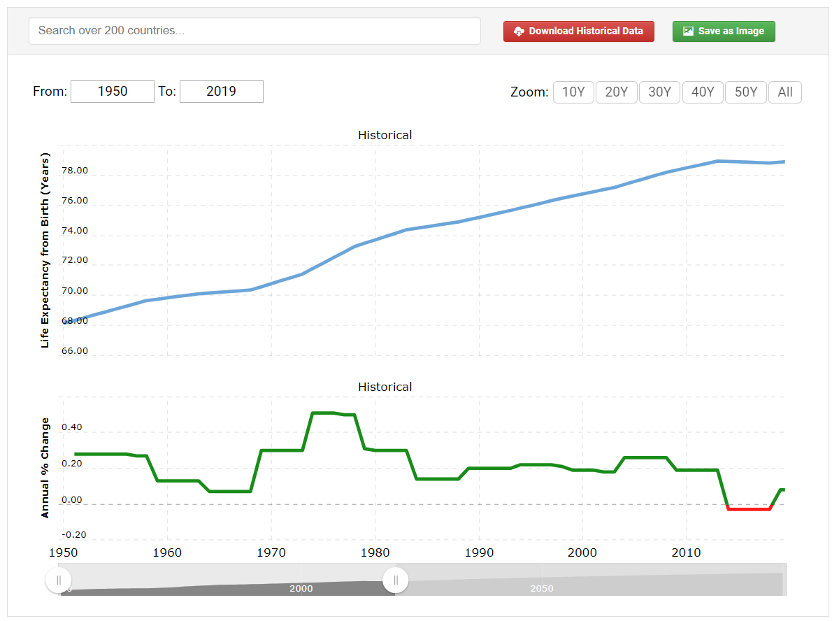
The US life expectancy curve has flattened in the last 5 years, so it would stand to reason that total mortality rates would also increase. It seems that if the life expectancy has gone down and death rates haven’t increased then we were ripe for a disease to come through and bring the numbers back up to the trend line. Source: https://www.macrotrends.net/countries/USA/united-states/life-expectancy (filter the years between 1950 and 2019)
So the most I can say about this data is that there is definitely a spike, but it is only the worst since 2014 because I don’t have the data. I would really like a comparison to the swine flu, SARS, Spanish flu, all in one graph. Is this a 1 in 10 year disease, 1 in 25, 1 in 100?
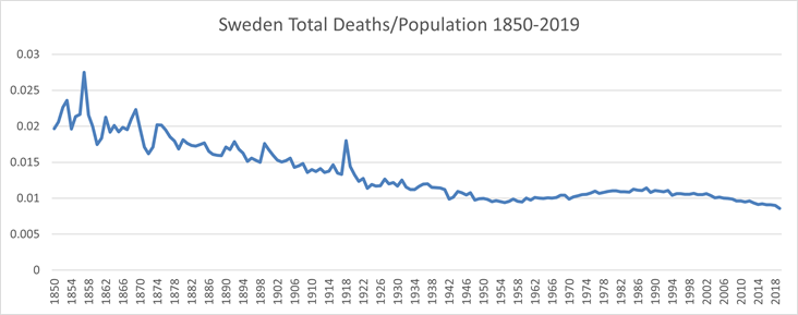
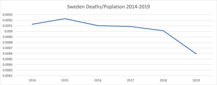
What I would like to see is a chart like the one I was able to gather about Sweden. Source: https://www.scb.se/en/finding-statistics/statistics-by-subject-area/population/population-composition/population-statistics/pong/tables-and-graphs/yearly-statistics--the-whole-country/population-and-population-changes/ I have also attached the spreadsheet with my chart in it.
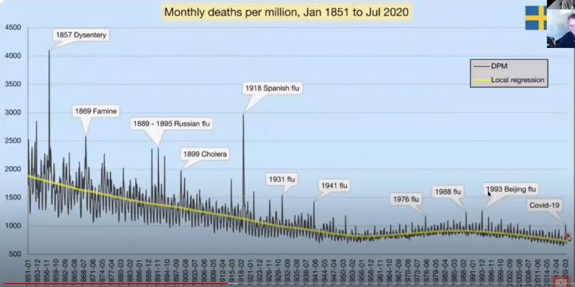
You can indeed find the catastrophic spike from the 1918 Spanish Flu. I replicated this based on a graphic I saw on a podcast. It has more annotations and a bit more detail but I was able to reproduce it pretty close so I trust it. Source: https://youtu.be/3BEfkKCXSOQ around 39:19
I don’t have the week by week data but Sweden has a precipitous drop off in 2019 which probably account for the bad COVID spike.
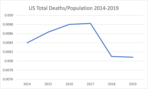
Here is a comparison with the US for those same years. I didn’t have the total population, but this chart would slope downward if it did. It looks very similar. We had less deaths in 2018 than 2014 with more people to draw from. There is a huge cliff in deaths in the years 2018 to 2019.
I’m trying to go to the original source because if you play with the numbers long enough you can tell any story you want. I suppose the purpose of this email is to question if the hysteria is actually warranted. I am having difficulty coming up with the data to support the hysteria (e.g. lockdowns, mandatory masks, …). It seems we have forgotten all we know about virus transmission from the last hundred years in favor of a myopic view of the last 4 years.
Help finding the US total mortality numbers for the last 100+ years would be much appreciated.
[ EMAIL END ]